Reports
Where the money went and where it's going, in seven views.
The screenshots are live captures of a demo account.
Last updated
Seven views of the same data#
All seven views read the same data, and all of them are read-only: there's nothing to edit, and no way to change a number by accident.
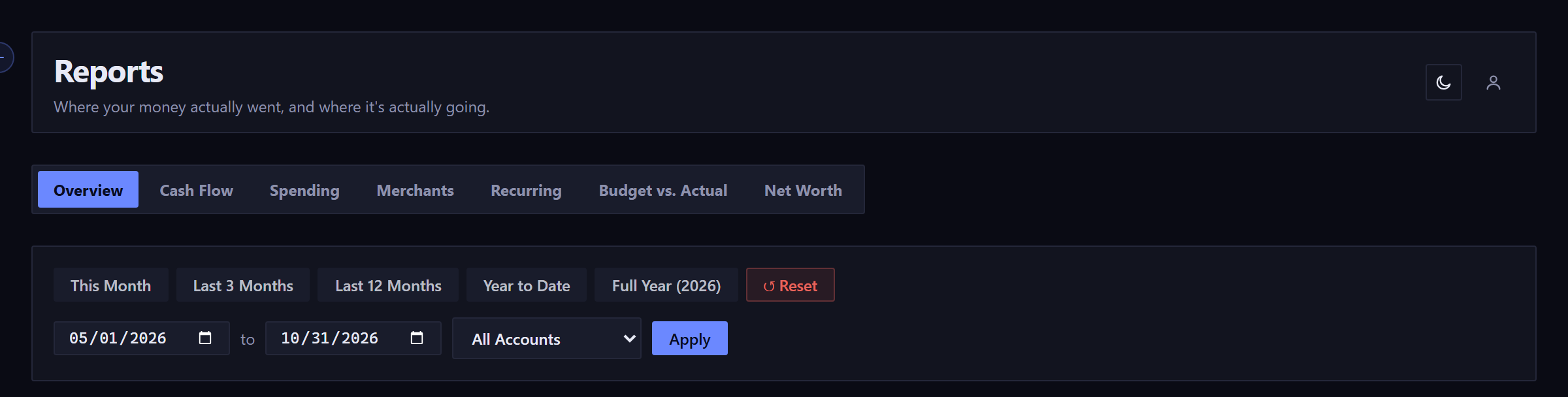
The default range is the last six months, not the current month.
Two tabs ignore the date filter#
Budget vs. Actual always shows the last six budget periods. Net Worth shows the last 12 months, or every month since your first account was added if that's fewer.
On those two tabs the filter bar disappears, and a line in its place says what window you're looking at.
Overview#
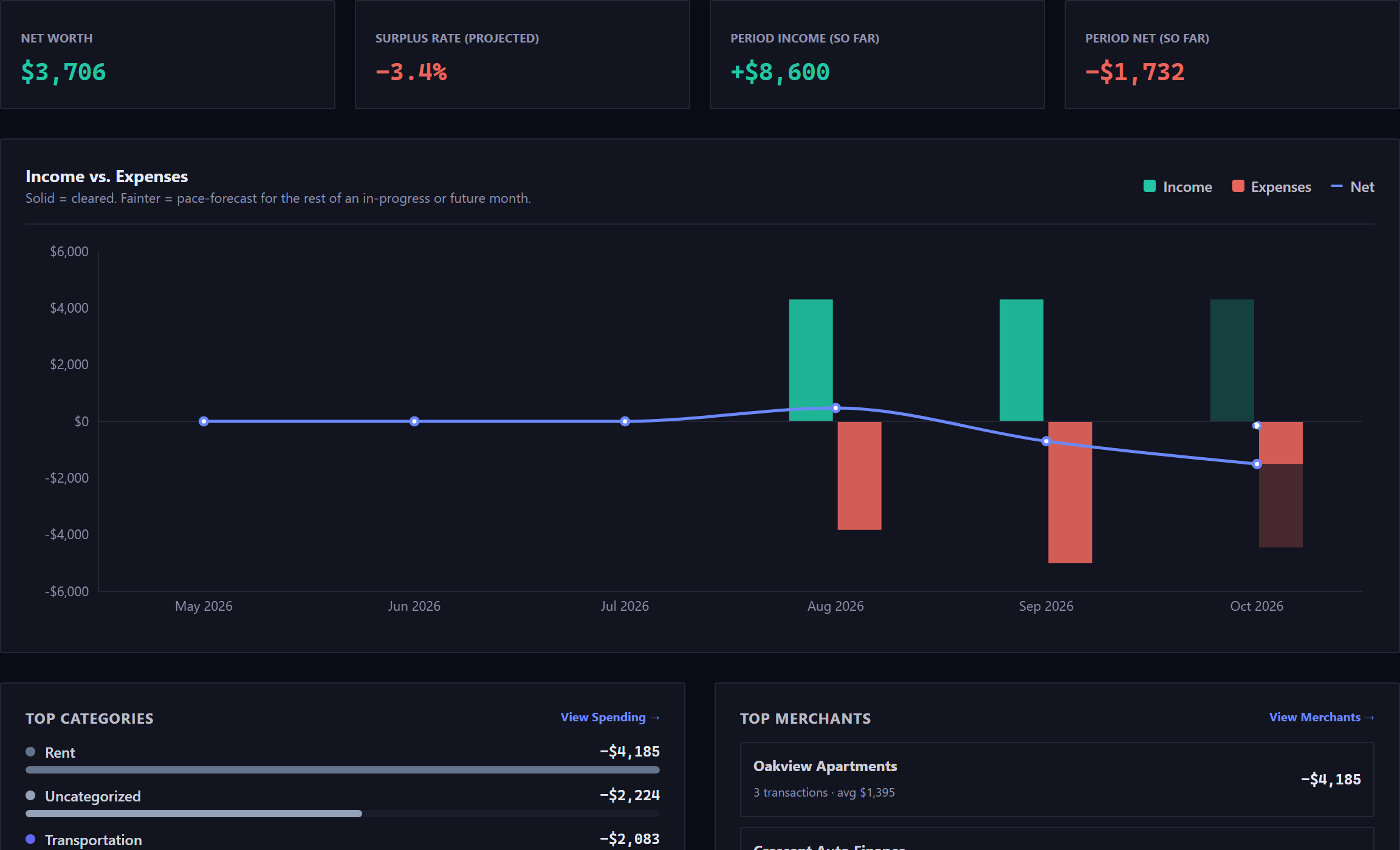
- Which span each tile is on
- The four tiles don't all cover the same stretch of time, so each says which it's on. (so far) counts only what has cleared, (projected) includes the rest of the period at your current pace, and (latest month) marks a snapshot, not a total. Hover any of the four for the whole sentence.
- When a tile and the chart beside it disagree about what sounds like the same thing, check the span: one is usually measuring the period so far and the other all of it.
- Surplus Rate
- Income minus expenses, as a share of income. It's what was left over, not what you moved into savings. A month with no income has no rate, so the tile reads none, with a line saying there was no income.
- The fainter bars
- A projection. For a month still in progress, the app adds what's already scheduled for the rest of the month to what has cleared, then adds your everyday spending at the rate of the previous three months. Bills are counted on the day they land, not spread across the month. A finished month has no fainter part.
- Top Categories and Top Merchants
- The five and three biggest, each with a link into the tab that shows all of them.
Spending and Money Flow#
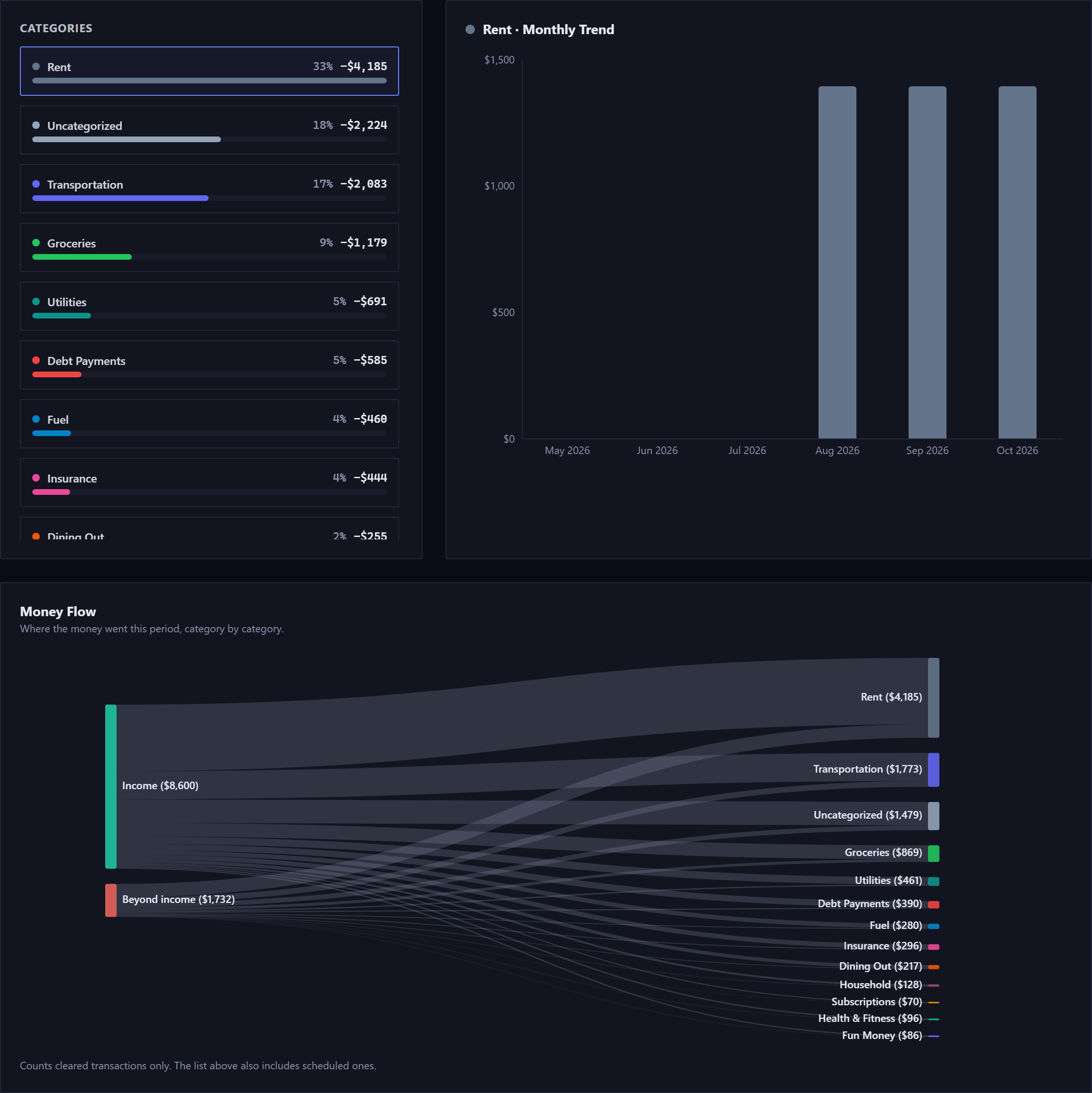
Select a category on the left to see its month-by-month trend on the right, with its subcategories expanded underneath. The first one is picked for you.
Underneath sits Money Flow: income on the left fanning out into categories on the right, each band as wide as its amount. Its Unspent / Saved band is what was left over. On a phone the diagram keeps its full width and scrolls sideways inside its panel, so no label is cut off.
When you spent more than came in, nothing is left over, and a second source appears beneath Income: Beyond income, carrying only the difference. That money came from your balance or a card, not from the range's income, and the diagram doesn't say which. Each category draws on both sources in proportion to its size. With no income at all in the range, Beyond income is the only source.
The two panels on this tab count different things. Money Flow uses only money that has cleared, while the category list above it includes scheduled items too, and a line under the diagram says so.
Merchants#
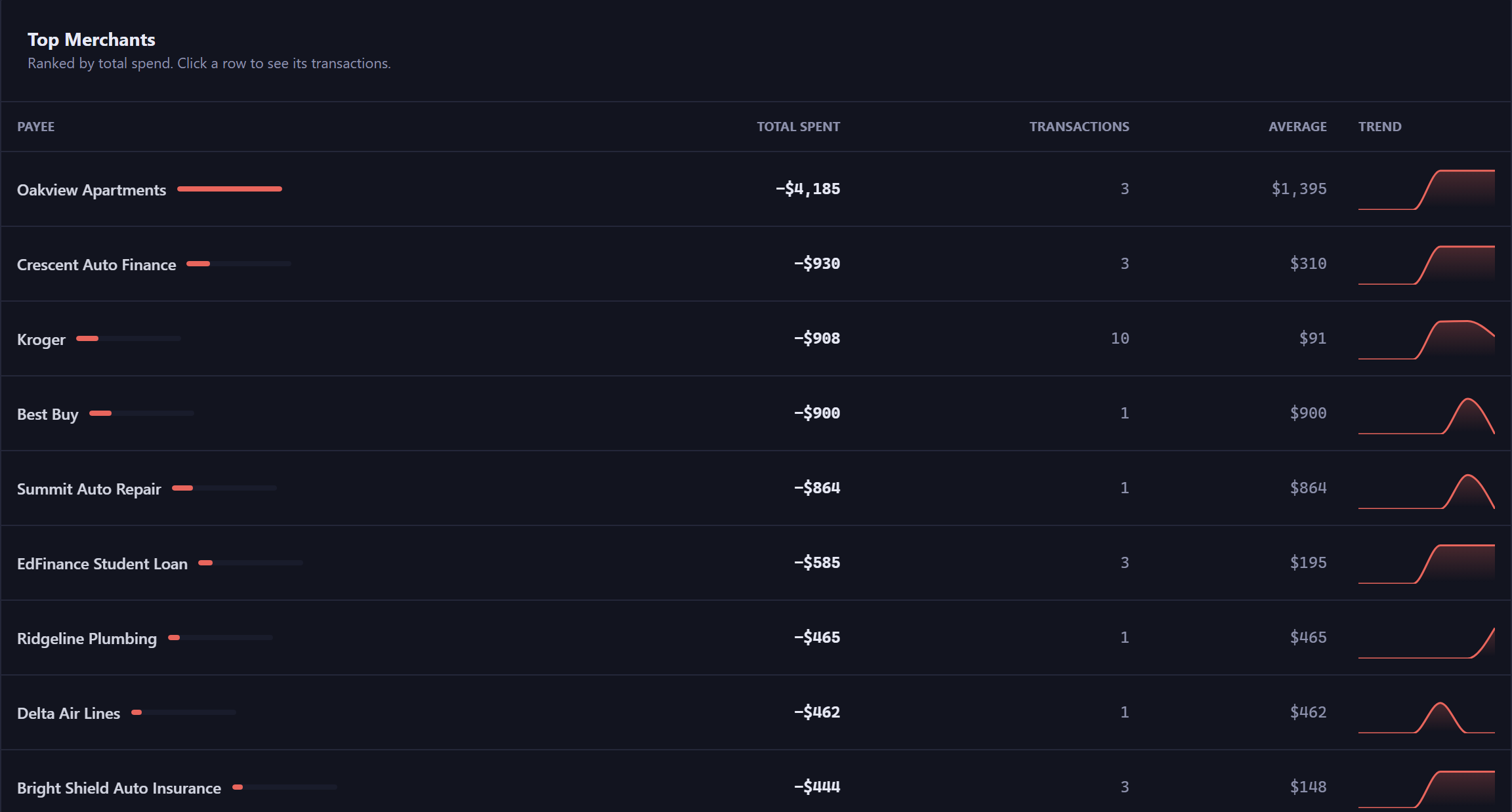
Ranked by what you spent, not how often. Every row is a link to the ledger, already filtered to that payee and date range.
Spellings that differ only in capitals count as one payee, named the way you type it most, the same as on the Payees page. A buy now, pay later plan counts as one row under the plan's name, with every installment in the total. Clicking a row shows that payee only, so a row for Amazon doesn't also pull in Amazon Prime.
Average is the total divided by the number of transactions. The small trend line at the end shows shape only, with no values to read off it.
Recurring#
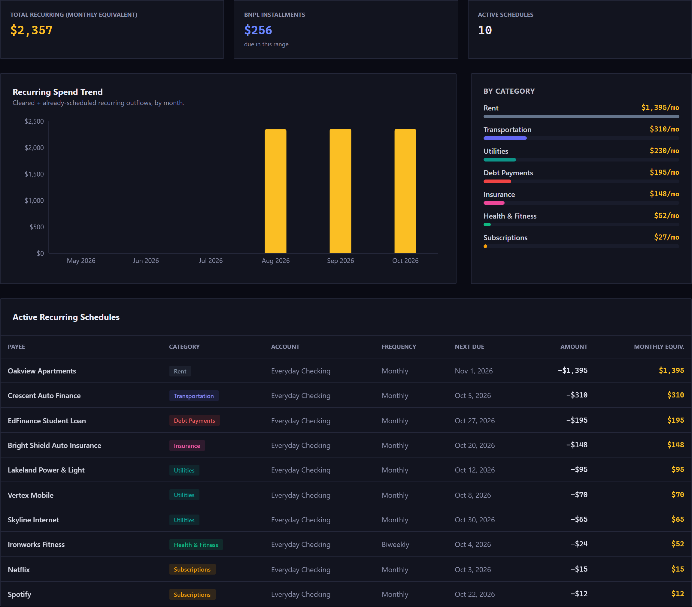
Monthly Equivalent converts every cadence to a monthly figure, so a weekly subscription, a quarterly bill and a yearly renewal can sit in one list and be compared. A yearly $120 renewal shows as $10 a month.
BNPL Installments is the one figure on this tab that isn't a monthly equivalent. It adds up the installment payments of your plans that fall inside the range you've selected, paid and still to come, so a range covering next month shows what next month's plans will take.
Next Due is worked out fresh each time from the rule and today, and reads Ended for a rule with no further dates.
This tab covers commitments going out, so income rules and transfers between your own accounts are left out. Its Monthly Equivalent is a normalized average, a different figure from the Monthly Out on the Recurring page, which counts what's really due in the next 30 days.
Budget vs. Actual and Net Worth#
Budget vs. Actual shows the last six budget periods for each budgeted category, with planned against what you really spent. The variance is planned minus actual: green with a plus means you came in under.
Each period shows the budget as it was at the time, even if you've changed the amount since, and a budget doesn't appear in periods that ended before you created it. The tab is hidden if you have no budgets at all.
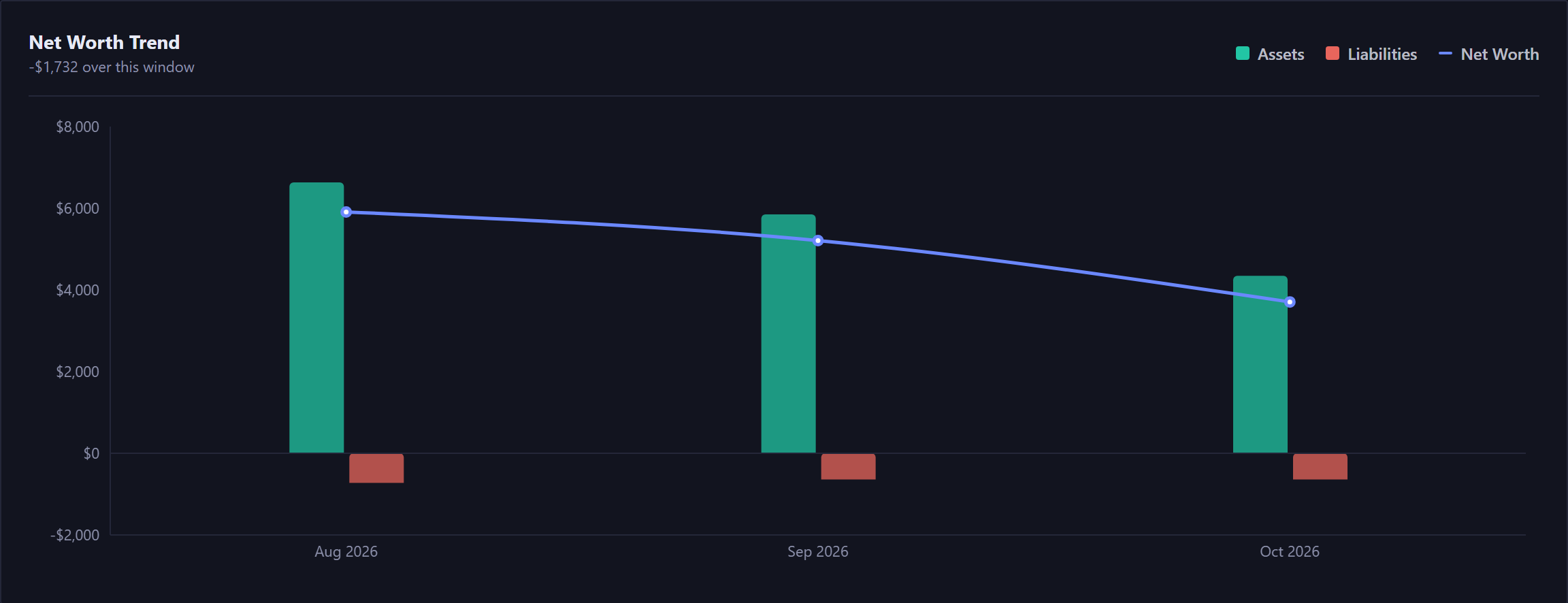
Net Worth is assets minus what you owe, over the last 12 months. It starts no earlier than the month your first account was added. Liabilities are drawn below the zero line.
Net Worth is the one tab built only from what has cleared. Every other view here includes scheduled and projected items, so future months have bars.
When a panel is empty#
An empty panel says which kind of empty it is:
- "No categorized spending in this period"
- You do categorize things, just not in this range. Widen the dates.
- "Nothing is categorized yet"
- You haven't started using categories. They're optional, and this fills in if you do.
If something can't load, the panel says so in words. A failure never shows as $0.
New here? See what Forecast Commander does.